Classic vs. Modern: Kitchen Design Color Palettes That Inspire
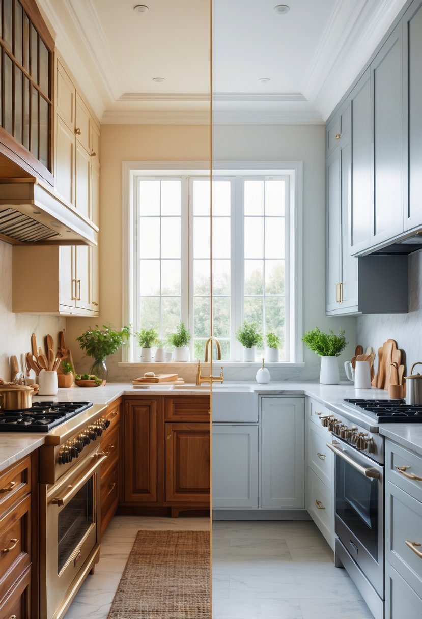
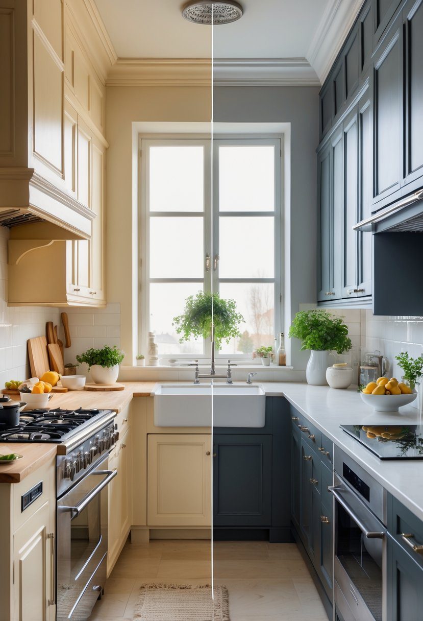
Choosing between classic and modern kitchen color palettes shapes the entire feel of the space. Classic designs often rely on timeless neutrals and warm tones that create a cozy and inviting atmosphere. Modern palettes, on the other hand, tend to use bold contrasts and sleek finishes to deliver a fresh, stylish look.
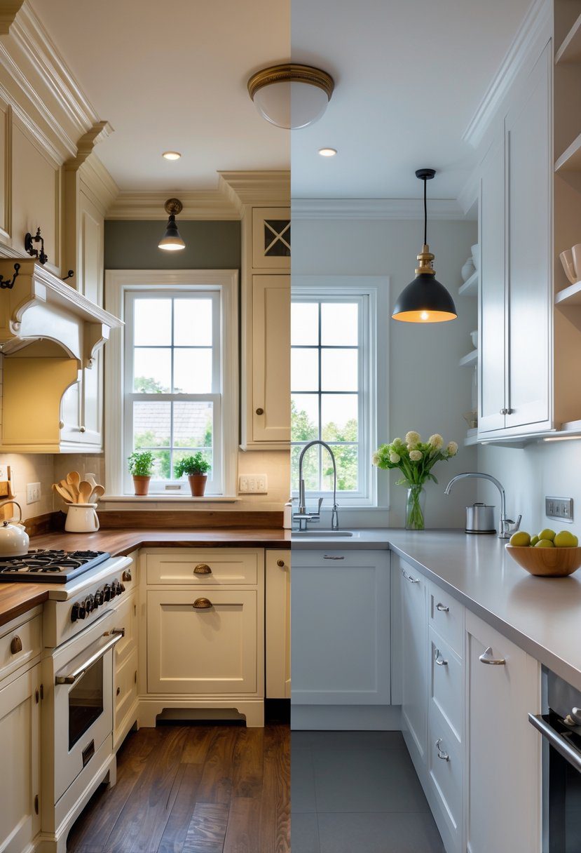
The main difference lies in how each palette balances color and mood: classic palettes offer comfort and tradition, while modern schemes bring energy and simplicity. Understanding these key points helps homeowners pick a scheme that fits their style and the way they want to use their kitchen.
Both classic and modern kitchens can be beautiful and functional, but the choice depends on personal taste and the desired vibe. Exploring the best color combinations for each style offers inspiration to create a kitchen that truly stands out.
Key Takeways
- Classic palettes focus on warmth and timeless appeal.
- Modern palettes use bold contrasts and clean lines.
- The right color choice depends on style and kitchen use.
Defining Classic and Modern Kitchen Color Palettes
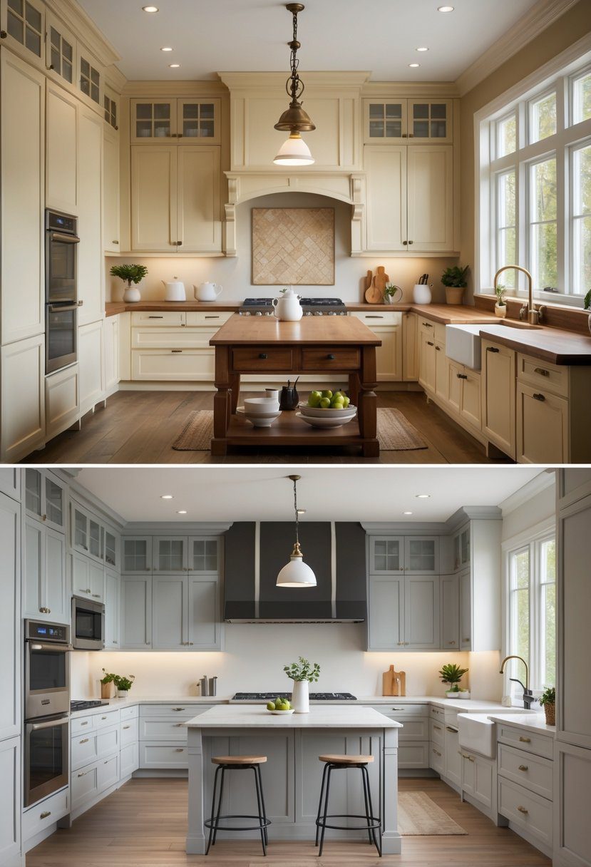
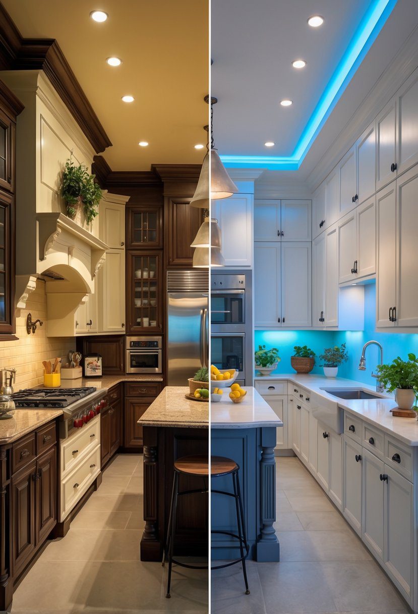
Classic and modern kitchen color palettes differ greatly in mood and purpose. Classic palettes emphasize warmth and tradition, with rich tones and timeless appeal. Modern palettes focus on simplicity, bright accents, and sleek neutrality to create a clean and efficient look.
Core Characteristics of Classic Palettes
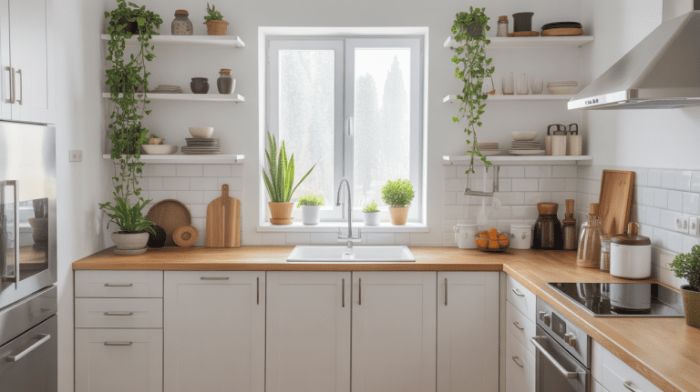
Classic kitchen palettes often use warm, earthy tones such as creams, browns, and muted greens. These colors create a cozy and inviting atmosphere. Wood finishes in warm shades add depth and richness to the space.
The use of subtle contrasts and natural hues helps keep the palette calm. Decorative elements like ornate hardware complement these colors, reinforcing a sense of tradition and craftsmanship. Overall, classic palettes favor depth and a softer glow.
Distinctive Features of Modern Palettes
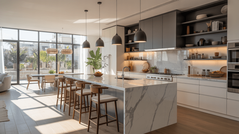
Modern kitchen color schemes lean toward minimalism. They typically use neutral tones like white, gray, and black, paired with bold color accents such as bright blues or yellows. This adds interest without cluttering the design.
Flat surfaces, handleless cabinetry, and clean lines emphasize simplicity. The palette supports a sleek, functional look that aligns with contemporary technology and open spaces. Bright accents often highlight key design features or appliances.
Historical Origins and Influences
Classic kitchen color choices are rooted in historical design traditions. They draw from early American, European, and country-style kitchens with wood craftsmanship and detailed moldings. The colors reflect natural materials common in these periods.
Modern palettes originate from mid-20th century design movements like Bauhaus and minimalism. These favored function over decoration with sleek, neutral colors. The shift aligns with changes in lifestyle, technology, and materials available today.
More on the distinctions can be found at modern vs traditional kitchen styles.
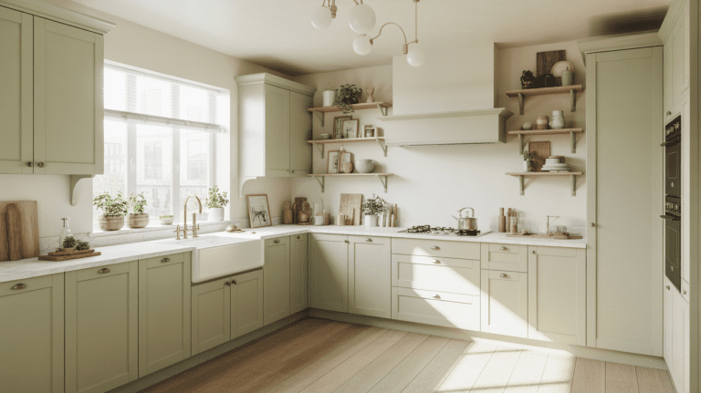
Timeless Classic Kitchen Color Palettes
Classic kitchens often use colors that create a calm and welcoming space. These colors work well over time, maintaining style without needing frequent updates. The palettes include soft neutrals, crisp whites, and warm shades inspired by nature.
Neutral Hues and Their Enduring Appeal
Neutral colors like beige, gray, cream, and taupe form the base of many classic kitchens. They create a versatile backdrop that pairs easily with different textures and materials. These shades help kitchens feel bright and spacious.
Neutrals also hide wear and tear better than bold colors. They support other design elements without overwhelming the room. People often choose neutral hues for cabinets, walls, and countertops because they blend well with wood, stone, and metal.
These colors suit many decor styles, from rustic to elegant. Their long-lasting nature makes them a practical choice for homeowners who want a stylish but steady look.
Elegant White-Based Schemes
White is a key color in timeless kitchen design. It offers a clean, fresh look that elevates the space’s brightness. White cabinets and countertops brighten rooms and make small kitchens feel larger.
Pairing white with soft grays or creams adds warmth and dimension. It can prevent the space from feeling too cold or sterile. White also complements stainless steel appliances and natural stone surfaces well.
Simple hardware and classic lighting highlight white color schemes, keeping the look refined. Because white works with nearly all colors and textures, it remains a core choice for classic kitchens.
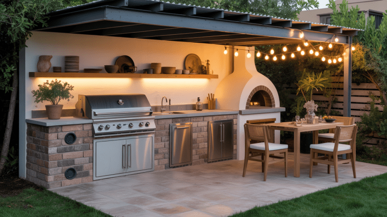
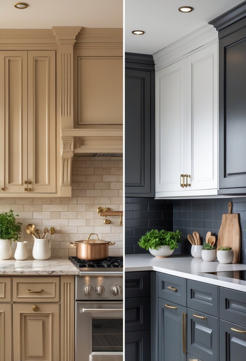
Warm Wood Tones and Earthy Shades
Warm wood tones bring a natural, inviting feel to classic kitchens. Colors like honey oak, cherry, and walnut add depth and comfort. Wood cabinets and floors create a timeless foundation that balances cooler colors.
Earthy shades such as soft greens, muted blues, and gentle browns enhance warmth without overpowering. These colors connect the kitchen’s design to nature, making the space feel grounded.
Using wood and earth tones together creates a harmonious, layered effect. This palette suits kitchens ranging from traditional to farmhouse styles while maintaining a classic vibe. For more details on classic kitchen color palettes, see timeless kitchen color palettes examples.
Striking Modern Kitchen Color Palettes
Modern kitchens often use strong color choices and simple shapes to create clean, impactful designs. These palettes focus on clear contrasts, limited colors, bold emerging trends, and shiny materials that update the look of any space.
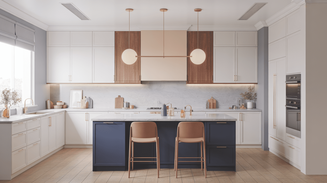
Bold Color Contrasts
Bold color contrasts rely on pairing dark and light tones to create a visual impact. Black and white is a classic example, with black cabinets and white countertops offering a sharp, clean appearance.
Other popular pairings include deep navy with crisp white or charcoal gray with soft cream. These contrasts usually highlight kitchen features like hardware, appliances, and backsplashes.
Using bold contrasts keeps the design dramatic without overwhelming the space. It is a favorite for people who want a sleek, modern look that still feels dynamic and fresh.
Minimalist Monochrome Designs
Minimalist monochrome kitchens use shades of a single color for a seamless, calming environment. Variations in tone, texture, and material prevent these palettes from feeling flat or boring.
White, gray, and beige are common monochrome bases. Different finishes like matte, gloss, or satin add interest without breaking the color harmony.
This design style simplifies the kitchen visually and can make the space feel larger and more open. It works well in small kitchens or for those who prefer subtle elegance.
Emerging Trends in Vibrant Tones
Vibrant color tones are gaining popularity in modern kitchens as a way to express personality. Shades like mustard yellow, teal, and coral add energy without being overpowering.
These colors are often used on islands, backsplashes, or accent walls to avoid overwhelming the space. Different combinations, such as deep green with warm wood, create a natural, lively vibe.
Bright tones are balanced by natural materials and neutral hues for a controlled but energetic look. This approach keeps the kitchen feeling fresh and personalized.
Metallic Accents for Contemporary Style
Metallic accents add a shiny, reflective quality that modern kitchens often use to upgrade their style. Copper, brass, and matte black hardware or fixtures create elegant focal points.
These metals can be used in cabinet handles, light fixtures, and faucets. They contrast beautifully with dark or neutral cabinets, adding depth without complicating the palette.
Metal finishes also work well with stainless steel appliances, anchoring the kitchen in a contemporary aesthetic. They help blend practical elements with design flair.
Choosing the Right Palette to Inspire Your Kitchen
Selecting a kitchen color palette involves understanding the space’s natural light, your personal taste, and how the colors will stand up over time. The right choice can make the kitchen feel larger, warmer, or more modern. It can also affect future home value and how long the design stays appealing.
Evaluating Space and Lighting
The size of the kitchen affects color choices. Lighter tones like whites and soft neutrals open up small kitchens and make them feel airy. Dark colors work well in spacious kitchens, adding depth and warmth without overwhelming.
Natural light changes how colors look during the day. South-facing kitchens get strong, consistent light, so softer colors can balance it. North-facing kitchens get cooler, weaker light, so warmer hues like greige or olive green add comfort.
Artificial lighting also matters. Warm bulbs enhance warm colors, while cool bulbs make blues and grays more vibrant. It’s best to view paint samples at different times to see how the color shifts.
Personal Style Considerations
Kitchen colors should reflect the homeowner’s taste and lifestyle. Those who like classic designs often choose neutral palettes with warm wood tones or white oak, which feel timeless and welcoming.
Modern style lovers may prefer bold contrasts like black and white or vibrant hues that add energy. They often use sleek finishes like matte black combined with crisp whites for a clean look.
Comfort and usability should guide choices too. Warm earthy shades create a cozy ambiance, while bright colors can boost mood and appetite. It’s helpful to list favorite colors and test them with cabinet and countertop samples to ensure harmony.
Long-Term Appeal and Resale Value
When choosing a palette, thinking about resale value is important. Neutral colors such as white, gray, and green with brown undertones tend to appeal to most buyers because they create a fresh but warm environment.
Bold or trendy colors might seem exciting but can date quickly, requiring repainting when selling. Timeless palettes are safer investments, offering longevity and broad appeal.
Consider finishes as well. Semi-gloss paints are durable and easy to clean, making kitchens look good longer, which buyers appreciate. Limited use of bright accent colors can refresh the space without reducing marketability.
A well-chosen palette balances personal style with practical, lasting appeal. For inspiration, explore classic and contemporary kitchen color schemes.
Frequently Asked Questions
Choosing the right kitchen colors involves understanding popular schemes, what works best in small spaces, and how current trends influence cabinet choices. It also requires knowing how to pick wall colors that fit the style and finding palettes that remain timeless. The process benefits from clear methods for creating a balanced look.
What are some popular color schemes for modern kitchen designs?
Modern kitchens often use neutral bases like white, gray, or black. These are sometimes paired with bold accent colors such as navy blue or emerald green. The goal is to keep the space clean and minimalist while adding a pop of personality through color.
Which colors are best suited for small kitchen spaces to enhance the feeling of spaciousness?
Light colors like whites, soft grays, and pale blues help open up small kitchens. These colors reflect more light and create a sense of airiness. Avoid dark, heavy colors as they can make the space feel cramped.
What color combinations are currently trending for kitchen cabinets?
Warm neutrals with wood grain finishes remain popular. Bold hues like navy and emerald also appear as cabinet colors. These often contrast with lighter walls to create depth and interest in the kitchen design.
How can one choose the best wall colors to complement their kitchen’s overall design theme?
Selecting wall colors depends on the cabinetry and style. For modern kitchens, whites or muted tones balance bold cabinet colors. In traditional kitchens, warmer shades like creams and soft greens align well with rich wood finishes.
Can you list kitchen color palettes that have stood the test of time for a classic appeal?
Timeless classic palettes include warm neutrals such as beige, cream, and brown paired with wood tones. These colors create a cozy and inviting environment that never goes out of style, often seen in traditional kitchen designs.
What are some effective methods for selecting a cohesive color palette for a kitchen renovation?
Start by choosing a dominant color that matches your style. Add secondary colors for contrast and accents for interest. Testing samples in natural light helps ensure colors work well together before final decisions.